The Oaklea Builders website took a long time from inception to completion.
And it's understandable, it takes a long time to build a house and if you have a number of projects on the go there are only certain points when the project looks like it's worth taking a photograph that captures what the completed project might aspire to.
And then, there's the weather to contend with.....

Portraying a hint of reality
There is an assumption, and one practiced in the advertising and marketing industry, that most people like to see the pictures of a completed project or perhaps those prior to work commencing and those at the end to best demonstrate the work that has gone into it, a bit like the many house refurbishment projects on TV.
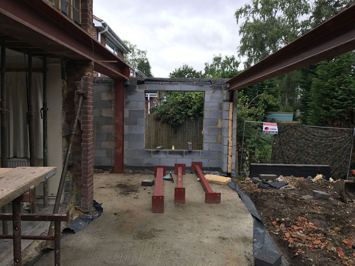
Pictures of some chilly builders working on the roof at 7 o'clock in the morning with a cement mixer and a portaloo in the front garden are more for entertainment where the personalities of the property owners and the tv presenters come into play as the project development slowly unfolds in the allotted 30 minutes of airtime?
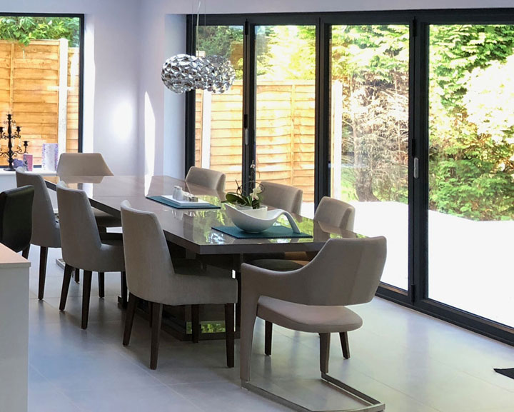
So on the majority of the building projects that we have on the website site the images are of the end product and yes, yes, you would.
But we wanted to demonstrate on the website that the team at Oaklea does start from absolute scratch from the initial design, architecture, procurement, the insulation, the use of eco-materials, and handmade furniture that you would initially think was bought in all the way through to doing the landscaping.
So we have included the odd photograph just to show that they really do get their hands dirty, but in the end, it all turns out rather nice.

Oaklea Builders are residential builders, they look at projects with a view to enhancing your lifestyle, maximising your usable space, and indeed increasing the habitable space footprint and typically reducing in the process the ongoing running costs of your home.
And what about the website itself? I hear you ask.
Well, it's very quick to load.
It's a bespoke website in that it was designed for a purpose, so there is no extraneous code or plugins.
It has a content management system that offers a lot of flexibility in terms of page layouts and is very easy to use..
The dynamic content i.e.project pages, news, and other content adopt the title, description, and metatags per the page properties as opposed to a blanket category, allowing more expression when appealing to the search engines.
It's mobile-friendly and it is as comprehensive on a mobile device as it is on a desktop pc.
The navigation is clear, you always know where are and only one click away from the majority of the site content.
You can tap on the phone icon to call direct or the email icon to send an addressed email.
Now we are hoping the weather combined with the progress of the various projects will yield some opportunities to bring some wonderful photographs to you.